


Rebranding is a huge leap, particularly for brands that have existed for quite some time. The choice to rebrand can be instigated by market forces, to align a brand closer to the company goals or customer needs, or simply through the need to bring new life to a tired concept.
So when it comes to nurturing the feel of a company’s new creative assets, it’s crucial they continue to remain engaging and true to the messaging people are familiar with.
No matter how subtle or significant those changes are, there will always be a strong focus on the intricacies of the detail to ensure the greatest impact. So here are some recent rebrands, and an analysis of how successful they were:
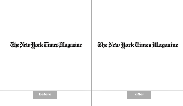
New York Times Magazine: Amended February
The magazine launched a new concept which included more “graciously spaced” lettering than the previous version.
The subtle change remained in keeping with the brand identity and character through the use of authentic, handmade lettering. The tweak to the kerning made the logotype more legible, although expert designers will greatly appreciate the time it took to amend it.
The introduction of a short form logo now caters to UI/UX demands for smaller devices and demonstrates the magazine’s willingness to be considered relevant in the digital age.
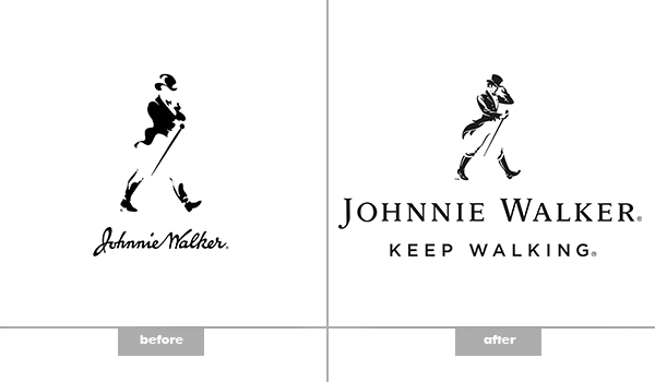
Johnnie Walker: Amended February
The Scotch whisky brand made a dramatic change from an almost Word Clipart design with an abstract silhouette, to a detailed, classic silhouette that pays homage to the Georgian era, when the drink was first brewed.
The brand identity remains very strong, and there is a clear hierarchy between the silhouette and logotype. The letters ‘J’ and ‘W’ are more clearly emphasised as the text has been changed from the signature style.
The logo holds on to a harmonious theme of traditional and classical through the negative space composition of the silhouette and the serif uppercase typeface.

Freeview: Amended February
This was quite a move away from the recognisable logo featuring an antenna. The subscription-free TV service launched a new logo featuring a bright colour gradient to make it appear more exciting and fresh.
The red/magenta/orange on the watermark along with the slightly geometric/abstract ‘F’ is appealing and original. Despite gradients having been played out many times before, the combination with the shape makes this visually pleasing.
There is a slight gradient in the logotype, which helps create harmony in the design, while the unique sans-serif typeface is far better than the generic and predictable older version.
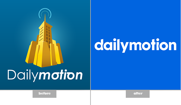
Dailymotion: Amended March
The icon in the logo for the video platform was not distinctive enough as part of the brand, so scrapping it came with few risks. The old execution of the word ‘motion’ has also gone, along with the dark teal background. In their place is a smoother wordmark and a more generic blue used by many other social media sites.
The integration of the overlapping characters ‘a’ and ‘o’ beautifully, and far more successfully, indicates motion. The geometric sans serif typeface, whilst reminiscent of Facebook, works better to make the brand one word, and ensures it is more UI/UX friendly.

Spotify: Amended June
The music streaming service focused on changing from a colour gradient to a solid green.
This simple adjustment makes it appear stronger and clearer as a watermark on smaller screens and devices. It also keeps it in line with the much used flat design trend.
It is arguably a boring, bland logo, made more so by the colour change, but that is what is required when the branding is stamped over often busier and more detailed images across various devices.

Facebook: Amended July
It’s probably a logo most of us see every day, but it may have taken an expert eye to spot the change to the design. The simple, generic typeface provides more white space and thinner lettering. The change to the letter ‘a’ was most significant, but amendments to ever letter (apart from the iconic ‘f’) make for a more organic and fluid logotype, rather than appearing too robotic.
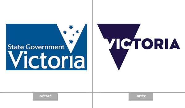
State Government Victoria: Amended August
The V logo was launched as part of a $20million marketing strategy by the state government.
It’s represents a drastic change from the previous designs, but there’s a sense the people behind it are trying too hard, and it appears clichéd.
The triangle to represent V for Victoria is too obvious, and applying the negative space with ‘Vic’ in the triangle forces the letters to seem squashed.
Despite changing the blue colour tone to a royal blue, which represents order and loyalty, there are better executions out there to express modern politics and commerce.

Australian Olympic Committee: Amended August
The reworking of the logo takes on the ‘less is more’ mantra, and uses a dark teal primary colour instead of black to make the design more modern.
Downsizing the logo and removing some of the detail made it more current, rather than traditional.
The hierarchy and centred typeface have remained true to the original, while the kangaroo, emu, and Commonwealth star, still represent the coat of arms of Australia, despite being more minimalist.
Sans-serif font, as with many rebrands, has once again been included as part of the overhaul, with the letters now much closer together for a compact design.
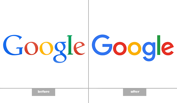
Google: Amended September
The update by Google garnered plenty of attention, and rightly so. It was refreshing to see one of the most prominent world brands move their logo into the modern age with a more minimalistic and sleek design.
Shifting from serif to a sans-serif typeface created a less cluttered design which is much more adaptable to UI/UX interfaces.
The softening of the colours helped bring the logo on trend, whilst still maintain the distinct multi-colour sequence and iconic rotated ‘e’.
The brand also released a compact Google G to work in smaller contexts and on its drive navigation.
By Jo Sabin, head of community at DesignCrowd.com.au, a logo, web and graphic design marketplace.