


The Australasian Writers and Art Directors Association (AWARD) has unveiled a new brand identity.
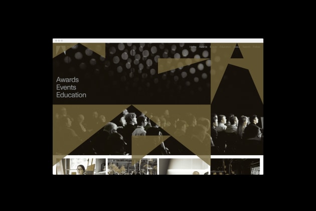
With a sharp upwards point reflecting both the AWARD Awards gold pencils and symbolising a capital A for Award, the new logo for the organisation represents its brand positioning as ‘the pointy end of creativity”.
AWARD chair Cam Blackley says the new brand identity reflects the direction AWARD is headed in.
“We’ve actioned changes to the Awards show from how it’s judged to diversity of panellists, we’ve overhauled the categories, we have initiated a craft course that begins later in 2020, we have bolstered our commitment to developing indigenous talent, plus we have been and continue to revitalise the AWARD Committee to be nationally focused," Blackley says.
“As we enter our fifth decade it’s time for us to present a new identity to the world. One that better reflects both AWARD’s incredible heritage and our future-focused philosophy.
“We commissioned M35, the premium design agency behind Nike Global Running, Create with Google, and AFTRS to develop an identity that shows we’ve grown up. When we saw the new brand mark we were bowled over both by its simplicity and the idea of striving towards the pinnacle. It just feels right.”
In addition to a new logo for AWARD, which includes variants for AWARD Awards and AWARD School, the new brand identity includes an entirely reimagined design system that encompasses typography, colour palettes, photography treatment and merchandise.
The new brand will be rolled out progressively in coming weeks across all AWARD’s digital and other assets.
“This was a fantastic opportunity to make a lasting and meaningful contribution to the creative culture of this region – and to collaborate with talented partners from different agencies," M35 creative director Jamie Mitchell says.
“The identity is designed to move AWARD towards a more progressive brand identity system which has the ability to adapt and change for specific audiences, channels and touch points; maximising brand impact, flexibility and recognition.
“The solution itself was inspired by the brand positioning 'the pointy end of creativity'. This input informs not only the shape of the logo itself, but also the secondary brand assets which are made up of overlapping fields of triangular shapes always moving upwards towards the pinnacle.”
The new brand identity has been unveiled ahead of the inaugural AWARD three-day creative festival that gets under way on March 25.
This will kick off with a 40th Anniversary Hall of Fame celebration at the Museum of Contemporary Art where guests will be entertained with a retrospective presentation of four decades of AWARD Awards, and new Hall of Fame members will be inducted.
Attendees will include past Hall of Fame inductees, former AWARD Chairs and committee members, and a line-up of international and local creative luminaries.
The festival will culminate with a new-look 41st AWARD Awards ceremony on the final night.
“Everything about AWARD Awards this year is fresh and new – from our new branding to the 40th anniversary party, revamped Awards night, and tougher, live judging where winners won’t be known in advance unlike previous years,” Blackley says.
“It’s the most exciting time for AWARD in years and we’re looking forward to welcoming our creative industry to help us celebrate.”
Have something to say on this? Share your views in the comments section below. Or if you have a news story or tip-off, drop us a line at adnews@yaffa.com.au
Sign up to the AdNews newsletter, like us on Facebook or follow us on Twitter for breaking stories and campaigns throughout the day.