


During the past year there’s been a surge of interactive out of home (OOH) advertising campaigns in Australia and an increasing number of big entertainment and retail advertisers willing to ride this digital wave.
Innovative concepts for national campaigns in major retail centres have created experiences that have been shared and amplified via social media.
They’ve ranged from touch-screen and gesture control gaming, photo booths, on-screen questionnaires, tap and pay donations, downloadable information and calendar updates, even fortune-telling.
Consumer engagement with retail OOH advertising reached new heights this year* and interactivity will continue its rise further in 2017.
At OohMedia, here’s what we’ve learnt.
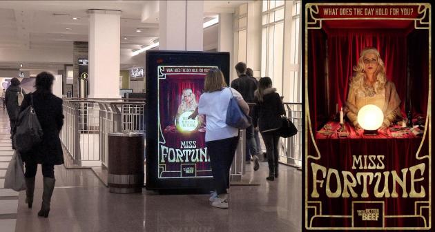
Meat & Livestock Australia’s interactive palm-reading campaign
1. Simple and clear outcome - Ensure the concept and user experience is as simple as possible yet engaging and leading to ideally one outcome. Don't try to force users to jump through hoops to interact with your brand. We've found the more simple a concept is, the higher the engagement rate and the larger the percentage completed.
2. Design for your audience and environment - Diverse target audiences and the environment of the screens require different design considerations. Consider accessibility, language, height, the audiences’ frame of mind and their dwell time. Instructions should be at the user’s eye-height, while adults’ input should be between their neck and chest height. Make sure the foreground and background colours contrast.
3. Call to action – Creative should look attractive, fun and enticing to encourage engagement. A button is the most effective call to action. A button lets people know it's interactive. It needs to be large and easy to press quickly. An animated screen will attract shoppers’ attention and entice users to interact.
4. User experience – It’s essential users enjoy, and find it intuitive to interact with the advertising, so expert app design is a must. Bright, vivid colours should be used to draw attention to anything the user needs to find quickly. A simple linear flow and large buttons are important. In attention short economy, people prefer to read short lines of content. The creative possibilities are limited only by the imagination.
5. Analytics - Make sure it’s clear what customer information the advertiser wants to collect. Capturing personal information such as phone numbers or email addresses is possible if legal considerations are designed into the app. In addition, brands can use this opportunity to measure engagement as part of their boarder campaign metrics.
6. Audio - Generally interactive Retail Digital OOH advertising will support audio once the user starts, though it’s not permitted to attract people to the screen. Sound effects are best used to provide users with feedback that they are successfully interacting. Given OOH environments are busy and loud, voice overs should be supplemented with subtitles.
7. Testing - Ensure lots of goal-oriented testing is done as part of app development. This means involving people who haven't seen the app before and do testing in the field. Test everything, every level of functionality, the entire user experience. Don’t be afraid to make radical changes after testing.
8. Optimisation - The app that goes live on day one won't necessarily be the one that is used for the rest of the campaign. Based on feedback and analytics, the app should be continually improved and optimised until the campaign ends. During pre-production interactive digital out of home (DOOH) app builds will commonly have many iterations and overall can take six-to-eight weeks to develop.
9. Network scale and hardware - Traditionally interactive DOOH was confined to a couple of panels but improvements in technology and networks mean interactive can now provide national scale. There's less value in investing lots of time and dollars in building an app and only using it on a couple of panels. Choose a network that has the capability to bring the concept to life. Consider quality of the hardware, flexibility of the peripherals, capability to update and monitor remotely to ensure the campaign runs smoothly. Particular environments where people can walk by and standby should also be considered
10. Elements to avoid – We’ve covered the do’s. But what about the don’ts? Dragging is difficult for people to do over large areas. Drop-down menus are clunky and unintuitive. There shouldn’t be a need for them. Lay out all the information clearly instead. Try to avoid any design decisions that necessitate scrolling for many of the same reasons as dragging. Double-taps or clicks are never used in touch interfaces. This mostly applies for long presses too.
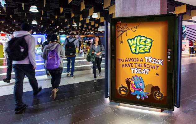
The Wizz Fizz Halloween campaign on OohMedia's Excite screens