


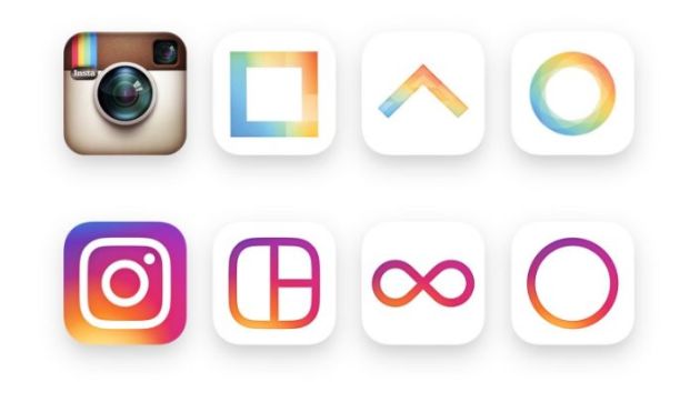
Instagram's new logo has received a lukewarm reception on social media with several users preferring the old look.
The social media network unveiled the new look yesterday, which ditches the rendered camera image in favour of a white "glyph camera box with lens" and viewfinder set on a coloured gradient of purple, orange and red.
In a blog about the design, Instagram's head of design Ian Spalter explains that flattening the image and using a glyph was important to allow the icon to be easily scaled.
"We realised we needed to move past a rendered camera to get a flexible, scalable glyph, but the previous glyph proved to be a weak basis for an icon," he says.
"To maintain the previous icon’s gravity, we had to figure out how to give the new mark more character while also removing what was unnecessary."
Instagram has also updated its Layout and Boomerang icons to reflect the new look.
Instagram designers are also working on a refresh to the user interface that reduces the colour and noise and removes some of the interaction.
"By paring down the new interactions and using standard iOS and Android components, fonts, and patterns, people will be navigating familiar terrain," Spalter explains.
The reception on Twitter has been mixed with some questioning the design process and others pining for the old logo.


Have something to say on this? Share your views in the comments section below. Or if you have a news story or tip-off, drop us a line at adnews@yaffa.com.au
Sign up to the AdNews newsletter, like us on Facebook or follow us on Twitter for breaking stories and campaigns throughout the day.