


WPP AUNZ, the new company formed by the agreed merger of STW Group and WPP, is set to unveil new black and white branding when the deal formally completes later this week.
The corporate branding is a series of black and white lines that look like contour lines on a map. It is set to be unveiled internally this afternoon, but is still subject to final approval when the deal officially completes later this week.
The new logo looks like this.

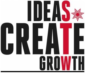
The STW Group has run with red branding with a star-shaped logo and the slogan “Ideas create growth”.
WPP AUNZ was revealed as the proposed name for the new company this morning at the shareholders meeting to vote on the merger. It is yet to be confirmed but is expected to become official in May at the AGM. The deal was “overwhelmingly” supported by shareholders and is set to complete later this week.
Read more about the merger here.
Have something to say on this? Share your views in the comments section below. Or if you have a news story or tip-off, drop me a line at rosiebaker@yaffa.com.au
Sign up to the AdNews newsletter, like us on Facebook or follow us on Twitter for breaking stories and campaigns throughout the day. Need a job? Visit adnewsjobs.com.au.